jquery制作漂亮的弹出层提示消息特效
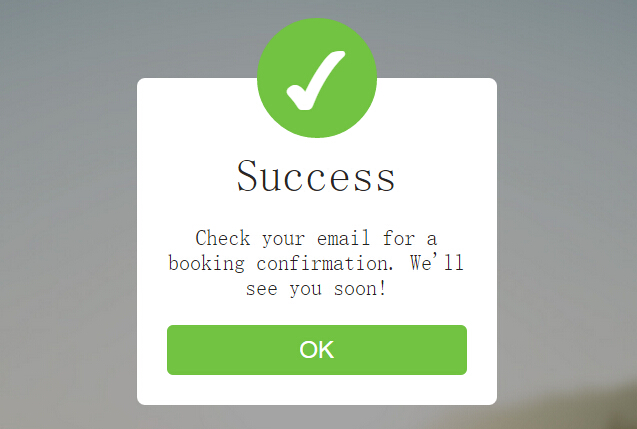
今天给大家带来一款基于jquery超炫的弹出层提示消息。这款实例页面初始时,一个go按钮。当单击go按钮时,提示强出层以动画形式出现。效果图如下:
实现的代码。
html代码:
<div class='b'>
</div>
<div class='bb'>
</div>
<button id='go'>
GO
</button>
<div class='message'>
<div class='check'>
✔
</div>
<p>
Success
</p>
<p>
Check your email for a booking confirmation. We'll see you soon!
</p>
<button id='ok'>
OK
</button>
</div>
<script src='jquery.js'></script>
<script>
$('#go').click(function () {
go(50);
});
$('#ok').click(function () {
go(500);
});
setTimeout(function () {
go(50);
}, 700);
setTimeout(function () {
go(500);
}, 2000);
function go(nr) {
$('.bb').fadeToggle(200);
$('.message').toggleClass('comein');
$('.check').toggleClass('scaledown');
$('#go').fadeToggle(nr);
}
//@ sourceURL=pen.js
</script>
css代码:
body, html
{
height: 100%;
font-size: 20px;
font-family: Source Sans Pro;
}
.b, .bb
{
position: absolute;
width: 100%;
height: 100%;
background: url("kje4L5j.jpg");
background-attachment: fixed;
background-size: cover;
background-position: center;
}
.bb
{
background: url("bDBs0et.jpg");
background-attachment: fixed;
background-size: cover;
background-position: center;
display: none;
}
#go
{
position: absolute;
top: 30px;
left: 50%;
transform: translate(-50%, 0%);
color: white;
border: 0;
background: #71c341;
width: 100px;
height: 30px;
border-radius: 6px;
font-size: 1rem;
transition: background 0.2s ease;
outline: none;
}
#go:hover
{
background: #8ecf68;
}
#go:active
{
background: #5a9f32;
}
.message
{
position: absolute;
top: -200px;
left: 50%;
transform: translate(-50%, 0%);
width: 300px;
background: white;
border-radius: 8px;
padding: 30px;
text-align: center;
font-weight: 300;
color: #2c2928;
opacity: 0;
transition: top 0.3s cubic-bezier(0.31, 0.25, 0.5, 1.5), opacity 0.2s ease-in-out;
}
.message .check
{
position: absolute;
top: 0;
left: 50%;
transform: translate(-50%, -50%) scale(4);
width: 120px;
height: 110px;
background: #71c341;
color: white;
font-size: 3.8rem;
padding-top: 10px;
border-radius: 50%;
opacity: 0;
transition: transform 0.2s 0.25s cubic-bezier(0.31, 0.25, 0.5, 1.5), opacity 0.1s 0.25s ease-in-out;
}
.message .scaledown
{
transform: translate(-50%, -50%) scale(1);
opacity: 1;
}
.message p
{
font-size: 1.1rem;
margin: 25px 0px;
padding: 0;
}
.message p:nth-child(2)
{
font-size: 2.3rem;
margin: 40px 0px 0px 0px;
}
.message #ok
{
position: relative;
color: white;
border: 0;
background: #71c341;
width: 100%;
height: 50px;
border-radius: 6px;
font-size: 1.2rem;
transition: background 0.2s ease;
outline: none;
}
.message #ok:hover
{
background: #8ecf68;
}
.message #ok:active
{
background: #5a9f32;
}
.comein
{
top: 150px;
opacity: 1;
}
以上就是基于jQuery制作的漂亮的弹出层提示特效的全部代码了,非常的漂亮吧,小伙伴们可以直接使用到自己的项目中去。